
A Simple Tip to Create Muted Color
Coming from someone with a pretty bright color palette!
I’m back from teaching a weeklong color and mixed media workshop in Santa Fe with Maru Godas. It was a blast and we played with watercolor, gouache, crayon, pencils, and more! Here is a quick tip from the workshop on starting with a basic palette and creating a more muted one.
The trick to muting a bright color is mixing in a bit of its complement. When painting with my limited color urban sketching palette, I approximate complements by picking the closest color in my palette, which works pretty well.
In the diagram below, I dull down an orange ( #1 ) with a blue from my palette ( #2). And vice versa.
My red is dulled down with a green, my yellow with a purple, and so on…
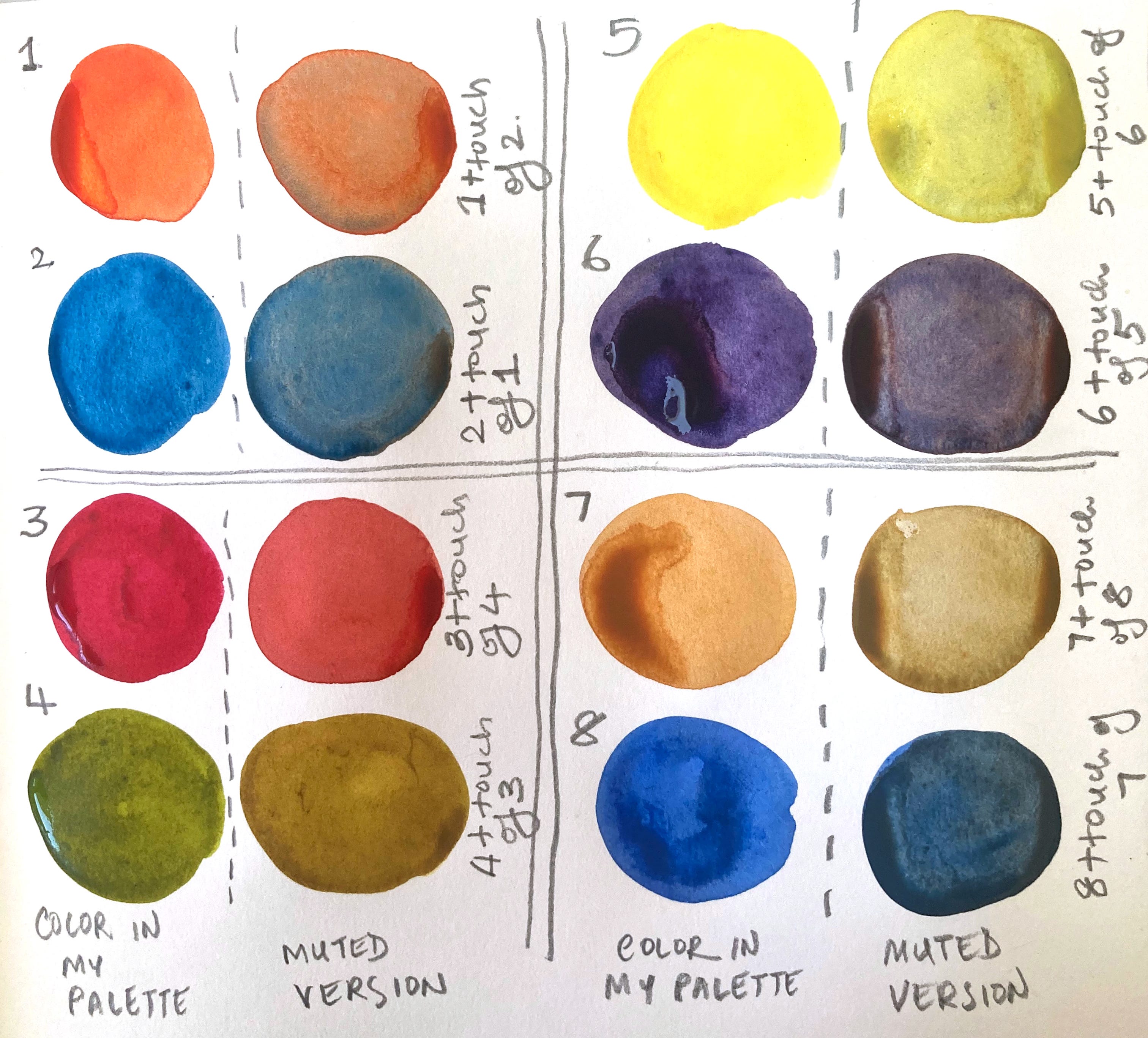
What if you want to dull down your orange but have more than one blue in your palette and don’t know which one to use? Swatch out mixes with them all and use what you like best.
Trusting your intuition and adding in a bit of experimentation is the way to go!
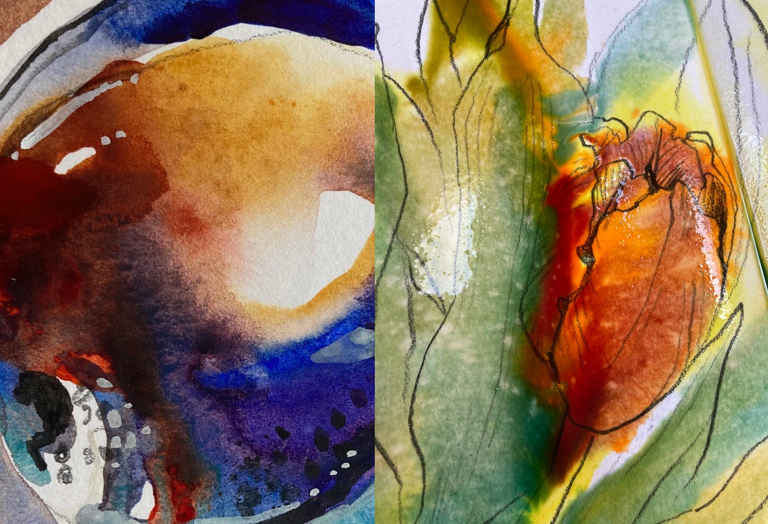
Easy enough, right? Mixing like this lets me get to interesting color variations in one step, which is all the mixing I want to do when working on location. I often put down complementary colors directly from my palette, letting them mix on paper. It’s exciting to work like this, exchanging control and predictable results for surprises and drama.
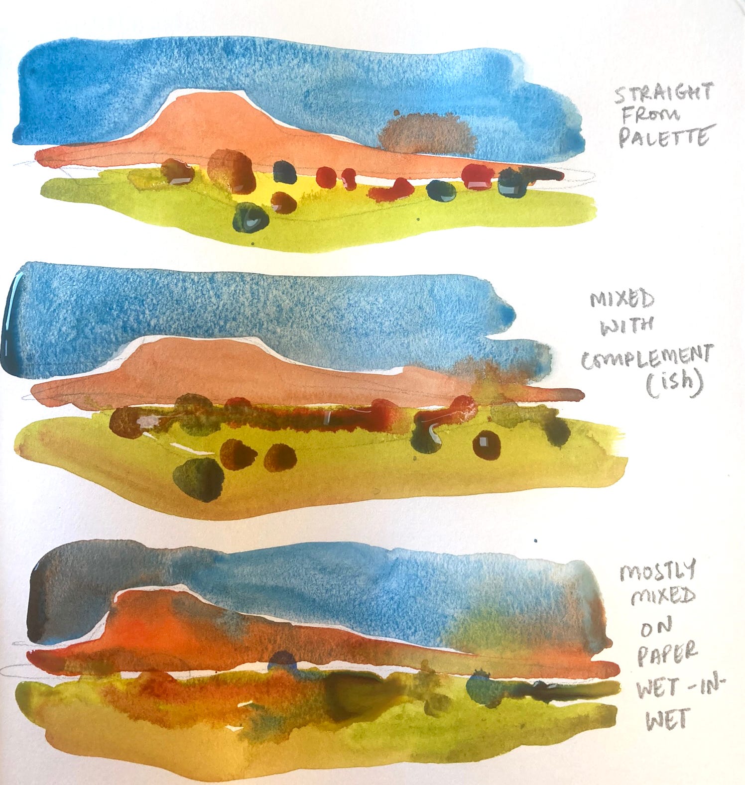
Here is a quick-and-dirty comparison:
Top: All colors direct from my palette. A bit flat and bright?
Middle: each color is pre-mixed with its complement. Better, I think.
Bottom: This is closer to how I paint, rarely pre-mixing colors, but instead mixing wet-in-wet on the page as I go along. Messier, and less predictable, but much more exciting.
I enjoy painting like this, pretty intuitively. But it’s very useful to understand color, color mixing, and the science behind it more deeply. Some of my favorite resources are:
• James Gurney’s videos and substack. Anything Gurney explains, he explains in a way no one else can!
• Handprint.com has everything you will want to know about watercolor. Pretty comprehensive, sometimes overwhelming.
• The “resources” section of Jane Blundell’s website. Great if you love knowing your pigments more deeply.
•Shari Blaukopf’s book on color for urban sketchers. This one looks at color through the lens of an urban sketcher’s limited palette size, which keeps the information bite-sized and relevant.
UPCOMING WORKSHOPS AND EVENTS (nothing new this month, just some stuff to watch for)
Gateway to India 2025 is now full!
Gateway to India 2025 is FULLY BOOKED. Use this link to find out more about it and write in if you want to get on the 2025 waitlist or the next workshop’s Early Bird List.
Color and Mixed Media in Santa Fe
Maru Godas and I just finished teaching the 2024 version of this workshop and will be back with our 2025 version. Watch for more details soon!
Going to Sketcherfest or the Chicago Symposium in July?
I will see you there!
If you are looking for a workshop with a specific subject/location? Just email me at suhita@gmail.com and let me know.
RANDOM STUFF
• The book I can’t stop opening and ogling at right now is a book of Georgia O’Keefe’s watercolors. They are delicious. Here are some of them. What I love about O’Keefe’s work is that she works across so many media and uses each of them for what they do best, and her watercolors truly celebrate the amazing stuff water and pigments come together and do!
• A subject that seems to be turning up often in my reading is the crippling effects of perfectionism.
- This substack newsletter has a piece about perfectionism and cooking
- This newsletter from Wendy MacNaughton is themed around perfectionism.
Want to join the “Sketching Together” Club, which hosts a sketching session once a month? Upgrade your subscription to join in this month’s session as an Annual or Founding member.