
Understanding Color through Interaction
And some free recordings and zoom sessions
It’s December, that time of the year that we all get bombarded with things to buy. I’m hoping this month’s newsletter is an antidote to that. There’s a clearly marked section towards the end of this newsletter, if you’re looking for workshops or prints. But the rest of this is a slightly rambling exercise in playing with and thinking about color.
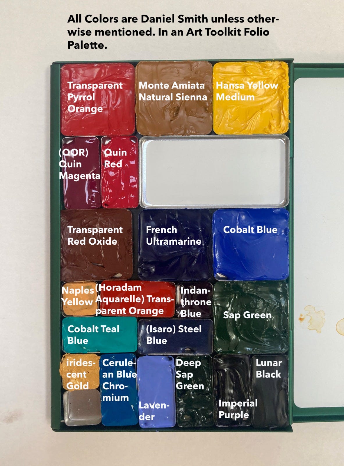
Take a good look at your palette. How well do you know your colors? And I don’t just mean their names and how they look when swatched out. The internet is rife with gorgeous samples of watercolor palettes gorgeously swatched in neatly delineated grids. I find them beautiful, but I never paint swatch girds. In part, because I haven’t the patience for them. But also because I understand color best in relation to other colors: As mixes, or as colors that play off each other.
Here’s something I do every once in a while, to get reacquainted with my palette. (For reference, this is what’s in my palette just now)
Color Mixes
In general, I can visualize what happens when I mix a red on my palette with a yellow or a blue with a red, so that’s not what I’m swatching here. What I’m doing is mixing contrasting colors. You’ll notice that I don’t get too exact about true complements, I just use the colors I have in my palette. Here’s a page with some of them.
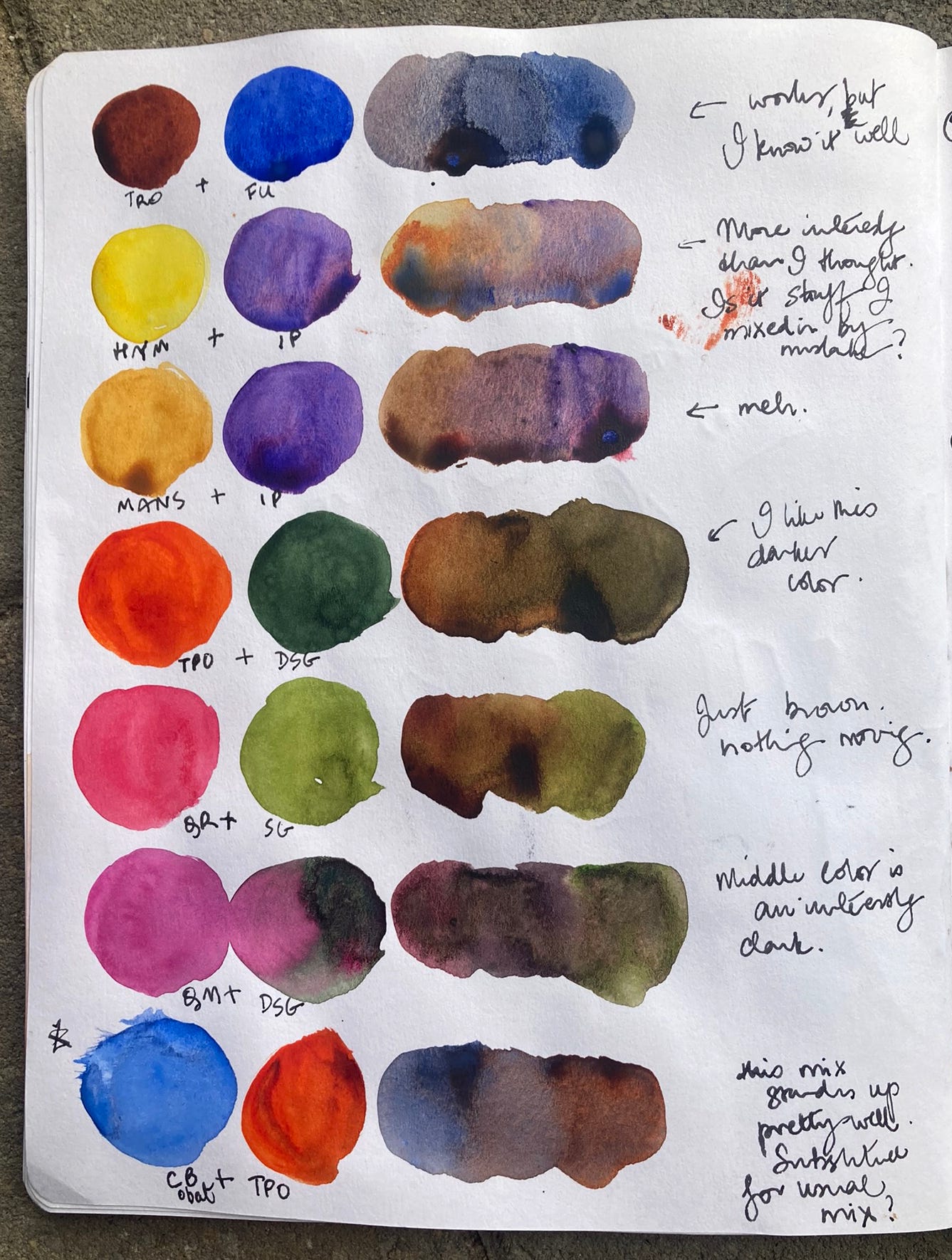
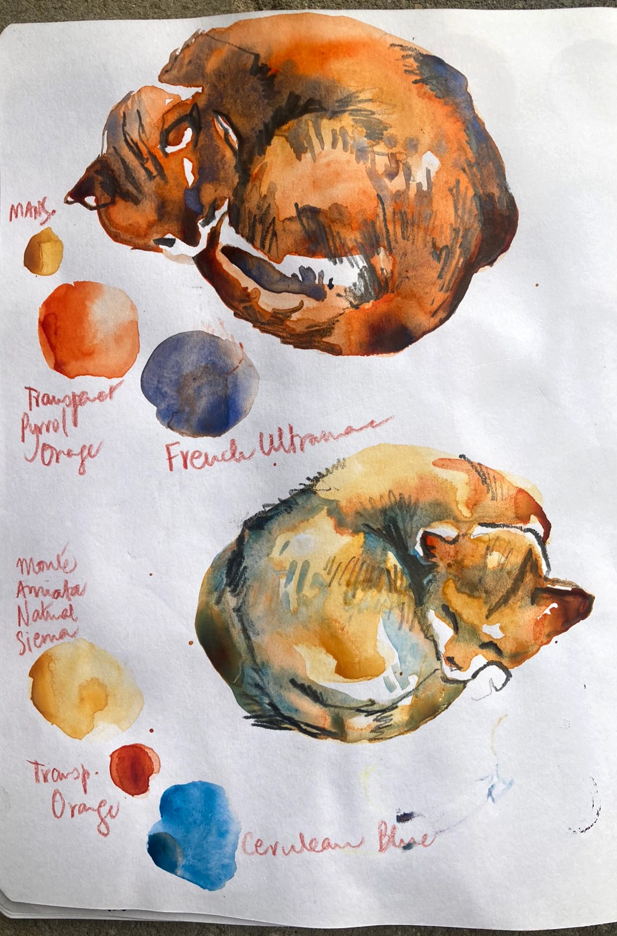
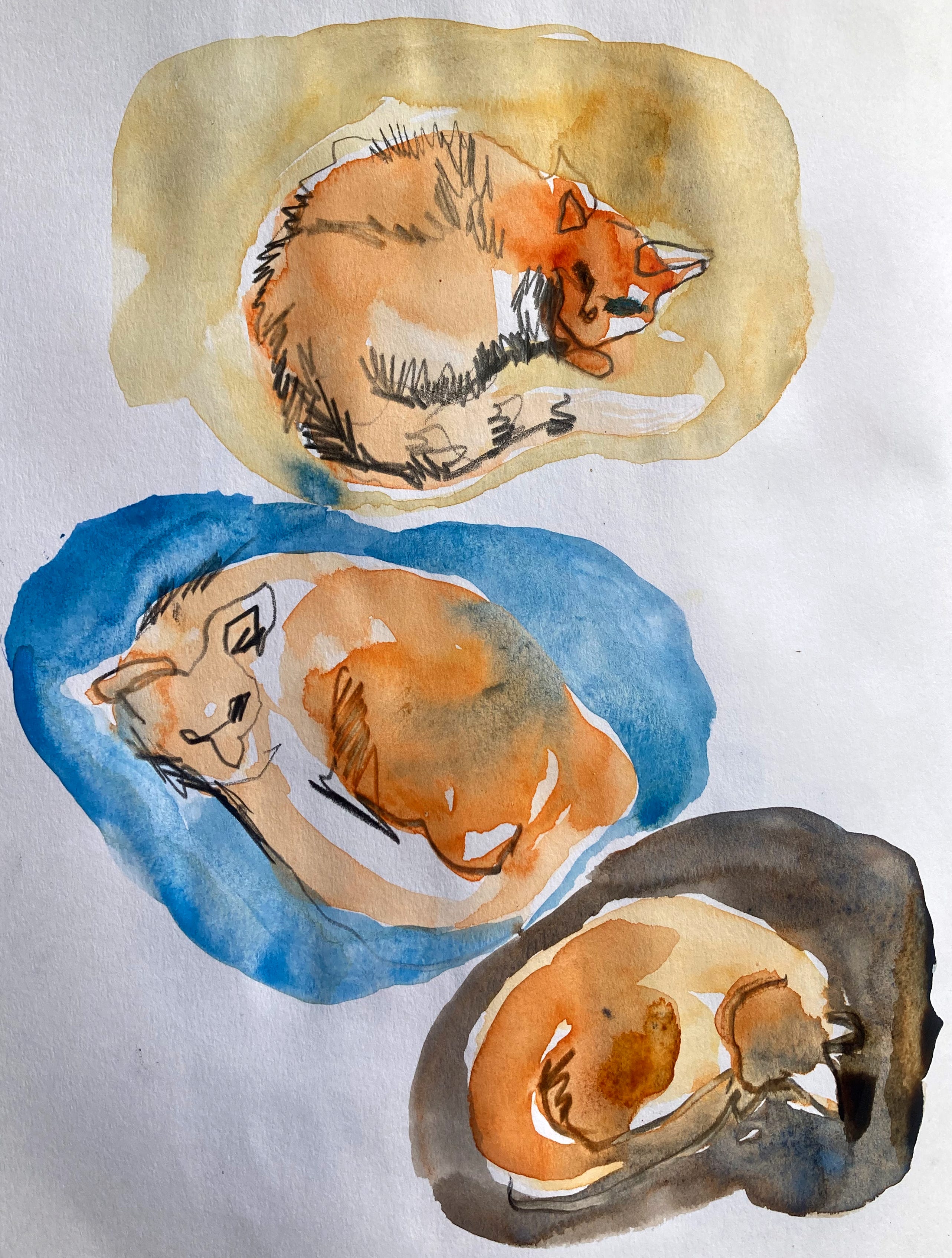
I always re-discover some interesting ways to mix up unusual neutrals when I do this little mixing exercise. Sometimes, I’ll try these mixes on a simple object. Or here, on my cat, who sleeps a lot in my studio in the winter.
Color Interaction
Another thing I like to do is look at how colors look in relation to each other.
Column 1 has colors from my palette. Column 2 surrounds them with analogous colors (colors close to them on the color wheel), Column 3 with a contrasting color, and Column 4 with a neutral greyish mix.
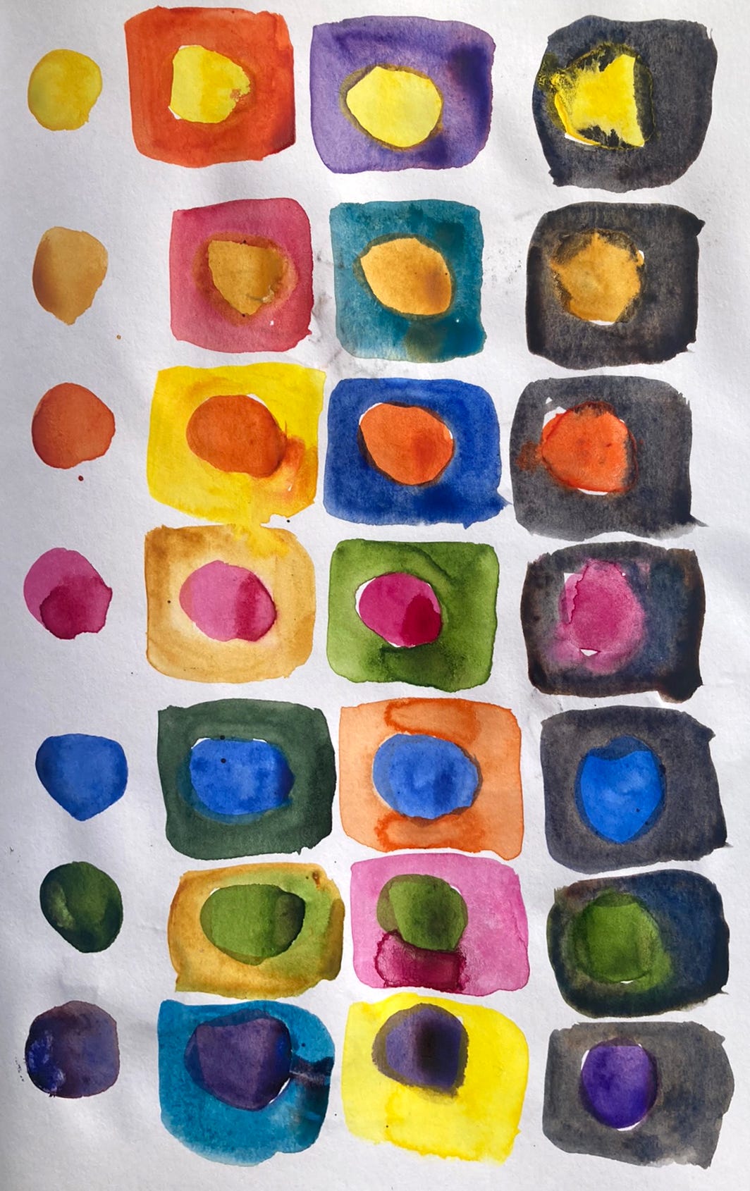
See how some colors pop more in certain pairings and get quieter in others? What you put next to a color changes how you perceive it. You can see these with my cat sketches too. Here is that sleeping cat surrounded by an analogous, contrasting, and neutral color. (There’s more going on with values and temperature here, but we’ll stick with just color for today)
Try these with your color palette, and you’ll be surprised by what you find.
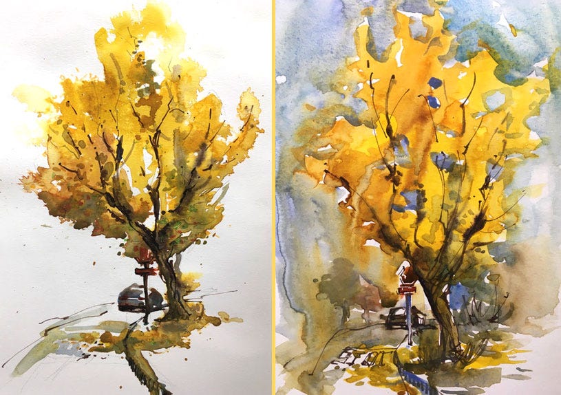
Here are two sketches I did of the same ginkgo tree. The one on the left reads as a yellow tree, but can you see how that yellow glows when it is surrounded by the sky which I threw a touch of lavender into?
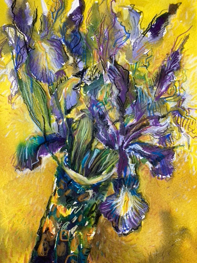
When I want high drama, I use a contrasting set of colors as my primary palette, with other colors, including neutrals, to bridge and connect them. Here are some purple irises offset by a yellow background.
Reds and greens create the drama in this next piece.
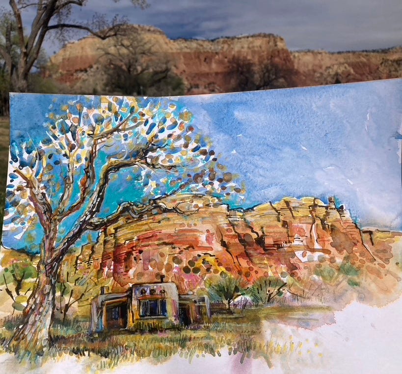
Blue skies bring out the orange in these rocks at Ghost Ranch, New Mexico.
If you try these color-swatching experiments, I’d love to know if you found any surprising mixes and color combinations you hadn’t used before.
Do you find these notes and experiments useful? Is there content you’d like to see more or less of? Write a comment and let me know!
Related Books
Here are some of my favorite books that explain or celebrate color.
• Color: A Natural History of the Palette. This is one of my favorite books on color and the history and geography of its origins.
• The Secret Lives of Color If you like to read in short little bits, then this is the book for you. Short little stories about each pigment
• Interacting with Color Josef Albers experiments made accessible.
• Color by Betty Edwards Betty Edwards explains it all beautifully.
Workshops, Fine Art Prints, and Substack Memberships
• This page has links to all my 2025 workshops with spots open, and 2026 workshops that you can get on the waiting list for.
• My Etsy store sells archival prints of my work. You can also request a print of almost any of my works you’ve seen online. Use discount code SKETCH1THANKS at checkout for 15% off. The shop closes for the holidays next week, so order now!
• Want to draw more in 2026? Upgrade your membership to be a paid member of this Substack, and join in on monthly sessions all year round for just $60/year.
Our December session is on Friday the 13th and we will work from photos and talk about color. A link with references and Zoom details will be sent to you, as well as a recording of the session.
Upgrade here to join the Sketching-Together group
Or, gift a subscription, using this link for as little as $7 for one month, or $60 for a whole year’s worth of sessions.
Free Stuff
• If you missed the Holiday Sketching Summit I was a part of (along with Oliver Hoeller, Darman Angir, Rob Sketcherman, Koosje Koene, Eduardo Bajzek, Jenny Adam, and Nishant Jain), you can access the recording using this link. The password is: #@KMMU0+
(My section starts at 28 minutes and 45 seconds into the recording)
• Through the pandemic, Paul Wang and I ran very regular sessions of a fun, experimental workshop called Sketching PlayLab. And while it’s been a quiet year for us, that won’t stop us from turning up on Zoom for our Annual Sketching Play Lab Holiday Party. Here are the details:
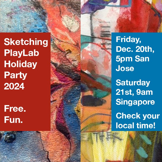
Bring some fun sketching tools and colors and a favorite holiday decoration to sketch and come join us for an hour of sketching together. We'll throw in some fun prompts and chat as we sketch. Join us on Zoom (link in bio) Open until the room fills up.
https://us02web.zoom.us/j/81895441157?pwd=VY8D3cPbskHZJmaOT308CuttSDeheI.1
Can't join us live? I’ll post a link to the recording in the next newsletter!
Thank you for sharing this information! I’m going to do these color mixing “exercises.” These seem much more useful than just swatching colors. Thanks!
The ginkgo comparisons are amazing. Thank you, so insightful.